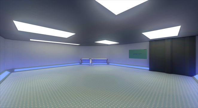
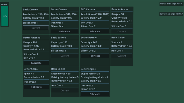
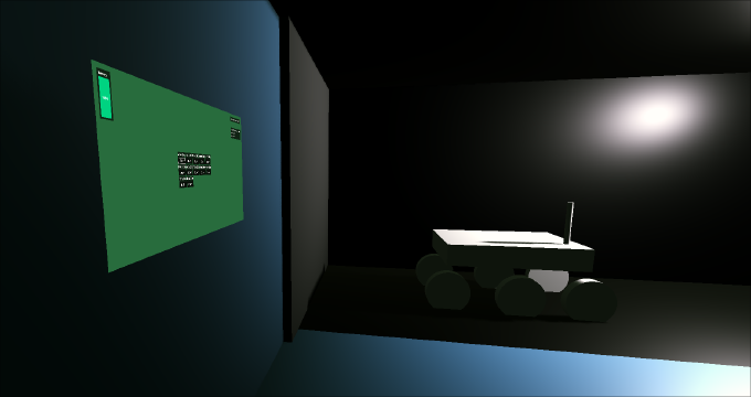
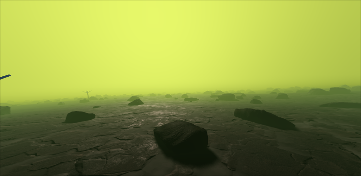
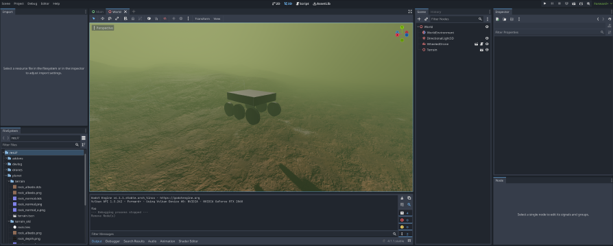
The time has finally come to move on from programmer art UI to something a bit better.
This involved quite a bit of planning, designing and bashing of my head. I had a general idea of how I want it to look, but, since I’m not experienced with UI design, it was very vague.
First, I gathered some inspiration/reference images (which was much easier after I found out about GameUIDatabase.com, it’s awesome!), mainly from Death Stranding and Armored Core 6 (which I was playing at the time (and I have just finished as of now. It was great.)), but also Destiny, In Other Waters and Outer Wilds.However, I ended up pretty much only going off screenshots from Armored Core (I mean, a rover is just like a mecha, right?).
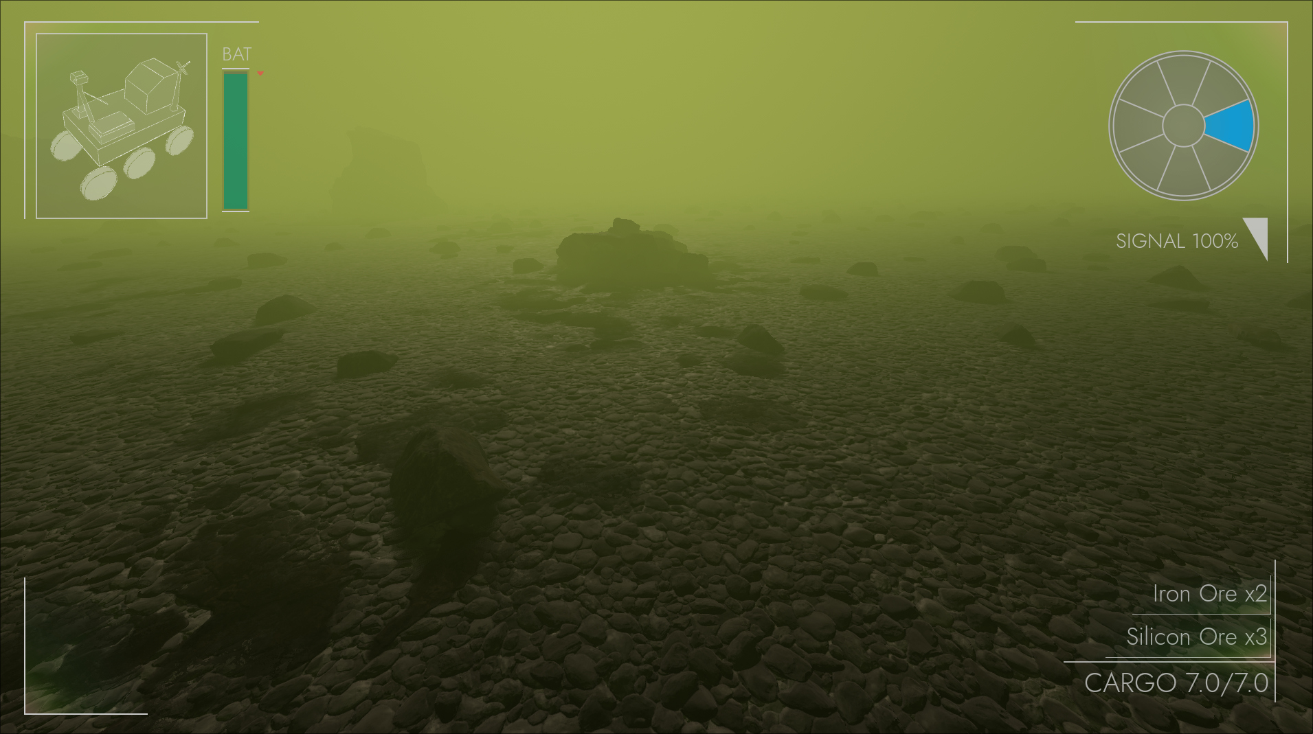
Getting to the point, here’s the before and after of the HUD (which is the most important part):
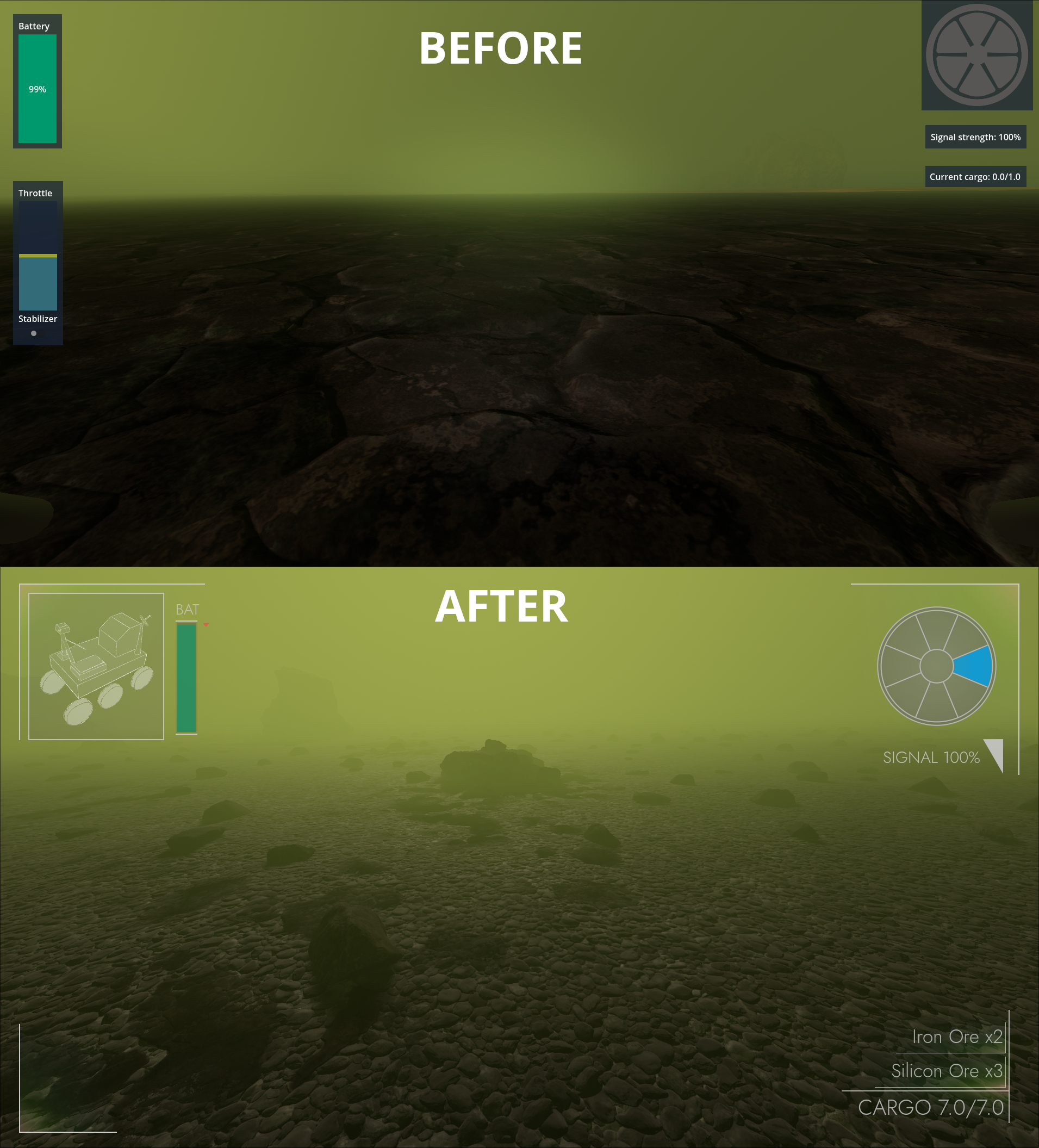
I’d say that’s a big improvement. Definitely still not a finished version though, but it will do for now.
Elements are now grouped spatially:
- top-left corner is for drone status (health, battery, etc.)
- top-right for things like radar, compass, scanner
- bottom-right is for cargo (because it deserves it’s own corner)
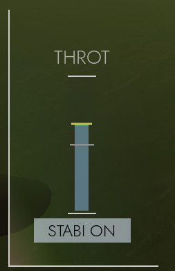
- bottom-left is currently empty for the rover, but the helicopter has it’s throttle gauge there, so it will probably be for movement related stuff
Component fabricator also got it’s upgrade:
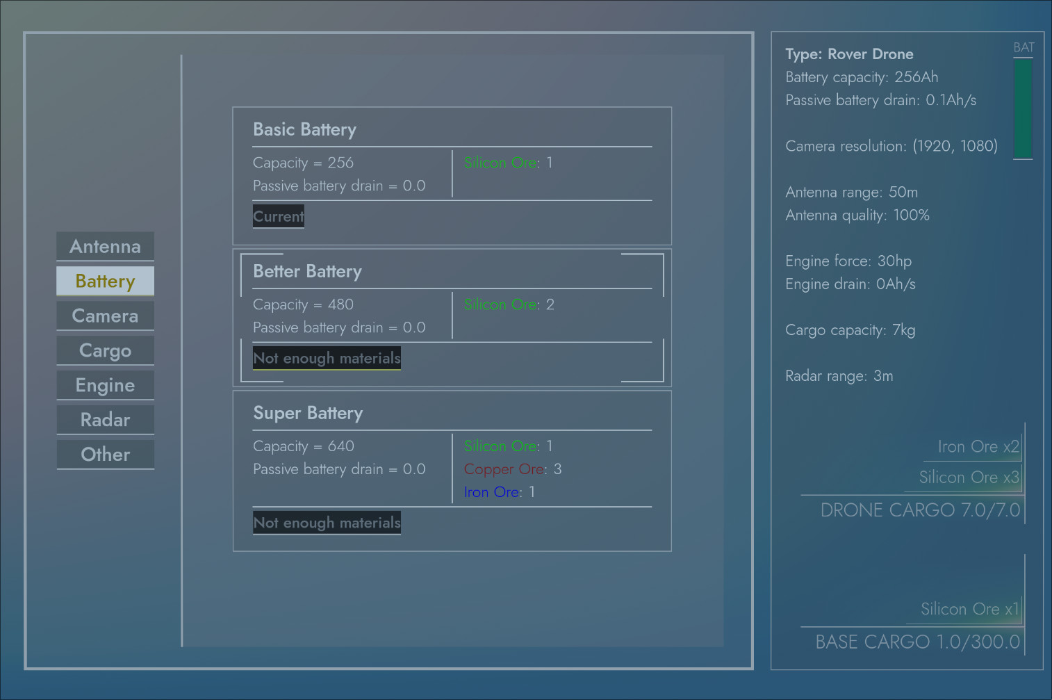
As I already said, still not a final version, but a big step in the right direction.
Getting to this point wasn’t easy though, mostly because technology has failed me. I wanted to do the UI design in a software designated for it, but I won’t allow myself to use Figma, so I looked for FOSS alternatives. I found Penpot, which looked promising, because you can self-host it. Unfortunately, after a while I realized that there are many small problems that add up to it not being worth the hustle and I decided to just make everything in Godot, which turned out to be a good choice.
The other problem was trying to make the image for the radar. It seems pretty simple at first, but it’s actually really hard to create it symmetrical and tidy. I tried Penpot, Inkscape, Krita, but all of them resulted in not-ideal versions, like this:

If you zoom in, you can see that the intersections are misaligned.
Which left me with the only reasonable choice: learn OCaml. Now, this might surprise you. Why does one need to learn OCaml just to create a simple shape? I don’t know the answer, it just is what it is. Well, actually, I looked for a “declarative way to create SVG images” and this OCaml library popped up: Vg. I wanted to give OCaml a try anyway. I have never written a single line of OCaml and so I didn’t have the environment set up. Tried dune and opam, but it just wouldn’t work.
So I did the only reasonable thing: create a Nix flake for this. This turned out simpler than I anticipated, because I just copied a template and changed a few things.
Then I finally could get to work. Once I figured out the basics of the libraries, it was really nice and simple. I’d say it was even easier than fighting any of the GUI applications. 10/10, would go through all that again.
Here’s the OCaml code, if anyone is interested: link to gist.
Now the radar is clean and mathematically perfect!

I have to say though, all this UI work got me pretty burned out. I don’t like working on UI and, while designing it was fun at first, implementing it was messier than I would like. Maybe I’m missing something. Or maybe it has to be like this.
Throughout this entire journey I was thinking about this meme:
(except the designing also became painful after a while)
Rant over.
I started this whole UI rewrite to add the drone health display, so now I can get back to that and finally be done with it. I’ll go over the health-stuff in the next devlog!
